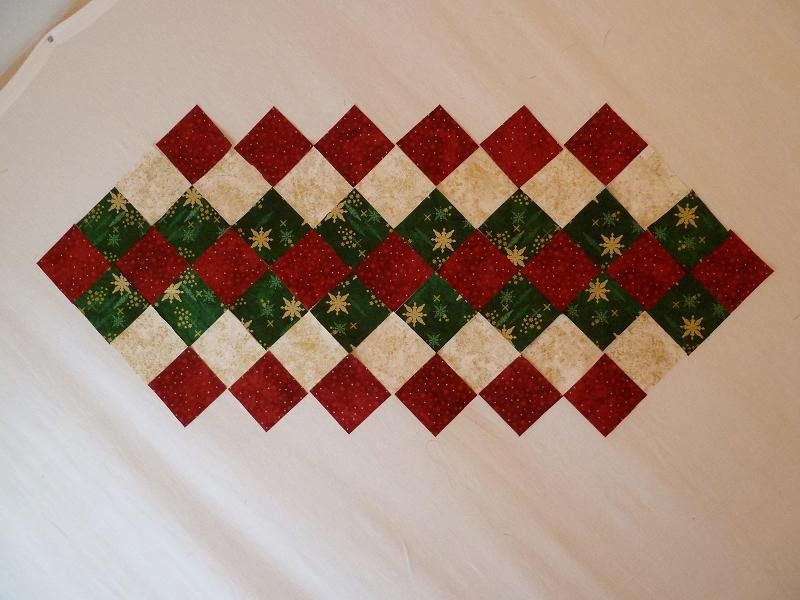
I cam home with this cute stack of Stonehenge by Sunshine Cottage for Northcott to make two table runners. The two runners would have the same prints in opposite colors to shake things up.
I cut them out and played with them on the design wall. I thought I was keeping it simple, but I still had a hard time making choices. This is my first try.
It was okay, but not totally singing for me. Then I laid out the other runner with the gold on the outside. I pinned up the binding to visualize it better.
I stepped back and looked at the two together. Still not quite right.
I decided to switch the green and gold in the first runner. Then I pinned up the backing to see how I liked it.
I switched the green and the gold in the second runner too. I like the outside triangles to match the binding a lot more. I also pinned up the backing for this one.
Then I stepped back and pondered--deep thinking going on here.
I fed Panda and Monkey some lunch and came back. I think it is good and I am ready to go sew while Monkey takes his nap.
I think it is funny that I like the green and red in the center with the green binding, but not the red and green in the center with the red binding. Is it because the green is a little darker than the red? Am I over-thinking this?
I am loving this fabric so much that I may have to go back to the shop and make a wall hanging with the tree panel they had displayed in the store. I have a weakness for seasonal quilts and table runners.
XX,
Jasmine
P.S. It really does help to look at them smaller. The fabrics blend together better. What do you think?


I think both are so pretty! You make me want to decorate for Christmas!
ReplyDeleteLooks great, I need to get busy with Christmas things!
ReplyDeleteI am with you, the green binding looks the best. I think it is because the contrast is higher and our brains like contrast! I also take pictures of WIPs and decide what to do that way. Looking at pictures is a great way to find mistakes and decide on values.
ReplyDeleteEsther
esthersipatchandquilt@yahoo.com
ipatchandquilt.wordpress.com